perplexity iOS App - simplifying ai interactions with elegant design
In the realm of mobile applications, the Perplexity iOS App
stands out as a paragon of design excellence, particularly for those seeking to engage with artificial intelligence (AI) in a seamless and intuitive manner. This app is not just a testament to the power of AI but also to the meticulous attention to detail in its user interface (UI) design.
User-Friendly Interface
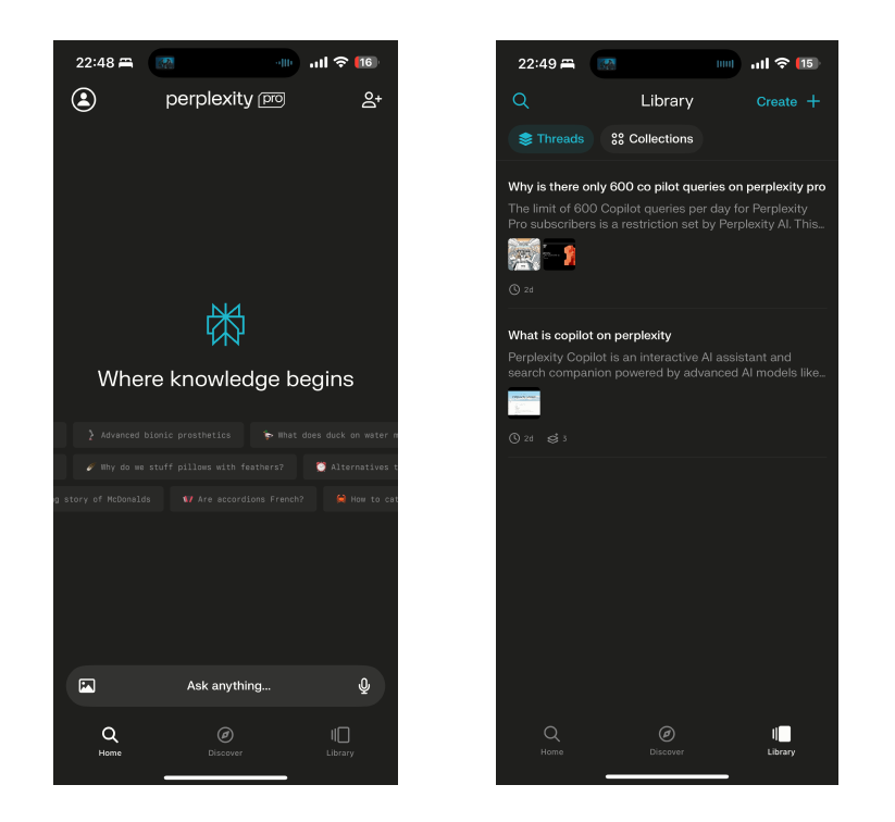
The Perplexity iOS App boasts a simple yet effective UI that caters to both AI enthusiasts and novices alike. Its clean and organized layout ensures that users can navigate through the app with ease, making web searches and AI conversations a breeze.
The app's design philosophy hinges on minimizing user effort and maximizing efficiency, which is evident from the straightforward presentation of options and settings
Design Challenges in AI Apps
Designing for AI introduces a unique set of challenges. An app must not only be aesthetically pleasing but also capable of handling complex and varied user inputs. It requires advanced natural language processing to ensure that responses are not only accurate but contextually relevant. The Perplexity iOS App addresses these challenges head-on by providing a platform where users can ask follow-up questions and delve deeper into topics without losing the thread of the conversation
Optimized for Mobile Use
The app's mobile optimization is another highlight, with a responsive layout that adapts to different screen sizes and orientations. This ensures that the user experience remains consistent and fluid, regardless of the device. The ability to access AI-powered assistance on the go is a significant advantage in today's fast-paced world, and the Perplexity iOS App delivers on this front
High Contrast Design: Enhancing User Focus
The Perplexity iOS App incorporates a high contrast design that significantly enhances the user experience by improving focus and readability. The stark contrast between the dark background and the bright text minimizes eye strain and allows for better concentration on the content, which is particularly beneficial when navigating through complex AI-generated information. This design choice is not only aesthetically pleasing but also practical, as it aids users in quickly identifying and processing the most important elements on the screen. High contrast is a critical feature for users with visual impairments, as it helps in distinguishing text and interface elements more clearly. Moreover, it aligns with the latest Web Content Accessibility Guidelines. See the full the Perplexity iOS App design here