Nobody Surf App Onboarding Review
NobodySurf is a surf video streaming app where you can find the world's best free-surfing videos created by surfers and filmmakers around the world.
It's a place to honor and celebrate creators' work and entertain surfers around the world. Explore and find your favorite surfing clips and short films.
Let’s take a look at how Nobody Surf onboard their users.
See more of the Nobody Surf UI here
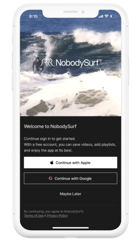
Welcome View
NobodySurf does well here with a clean and clear welcome view. The top half of this login view is a video bringing a lot of energy and excitement. The app does a good enough job to describe the benefits of creating an account.
Although the text here is a little small and could be easily missed.
No email and password entry as the app hands off registration to either Apple or Google. This definitely reduces the friction of creating an account.
I like the fact that the app offers an option to continue exploring the app without making an account by selecting maybe later.
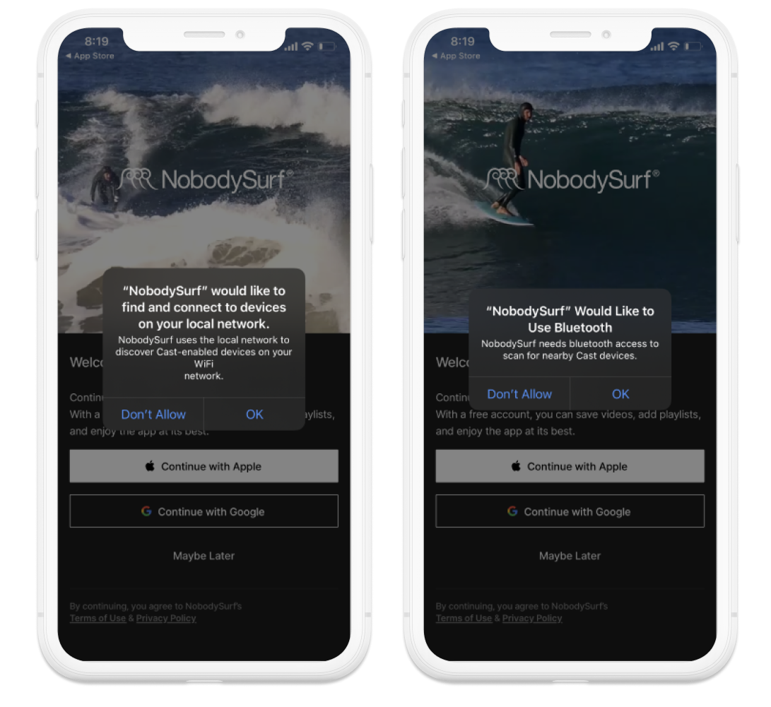
Permission Requests
After a few seconds on the Welcome view I got two permission requests back to back.
I thought this was a little too much given the fact that I had just opened the app and only just started to understand its value.
I feel like these permissions could be handled later on in the onboarding flow.
For example when tapping to watch a video for the first time or within the onboarding steps with some more context and background as to what value these permissions bring.
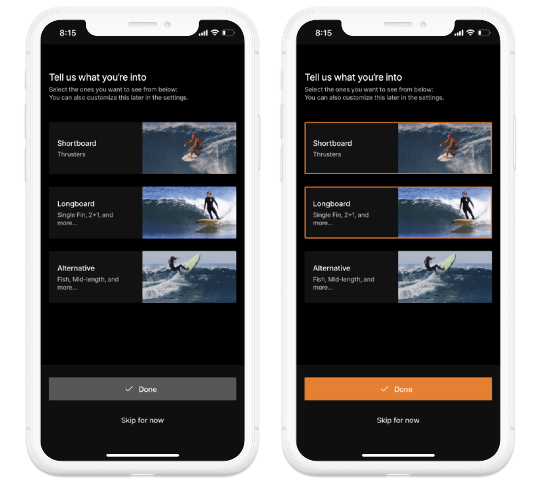
What are you into?
The app then asks you to choose the genres of surfing you are interested in. It breaks down into three broad but simple categories.
The copy writing here is clear and concise. However the sub text explaining what to do on this view is a little small.
Selecting the category adds the orange selection box.
I also appreciate the “Skip for now” option.
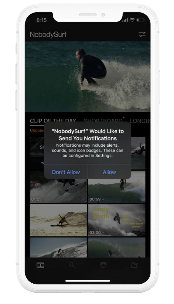
Landing View
After selecting interests you land in the main view of the app.
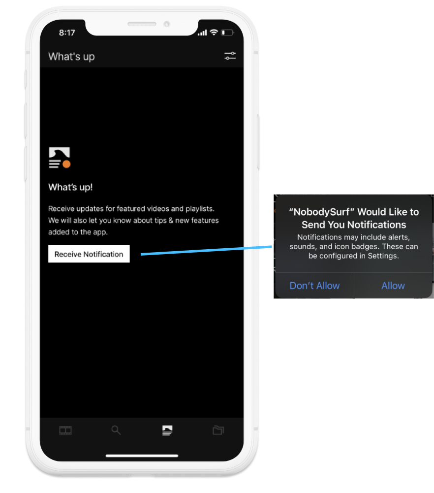
Immediately you are prompted with another permission request for push notifications.
The app does not do a great job to explain why notifications benefit the user. There is not much incentive to enable them at this stage of the onboarding. Perhaps the better place to prompt for notification opt-in would be after watching a video or two. The App could then suggest being notified when new videos in your selected genres are released by allowing notifications. This would add context and potentially increase conversion of opt-ins.
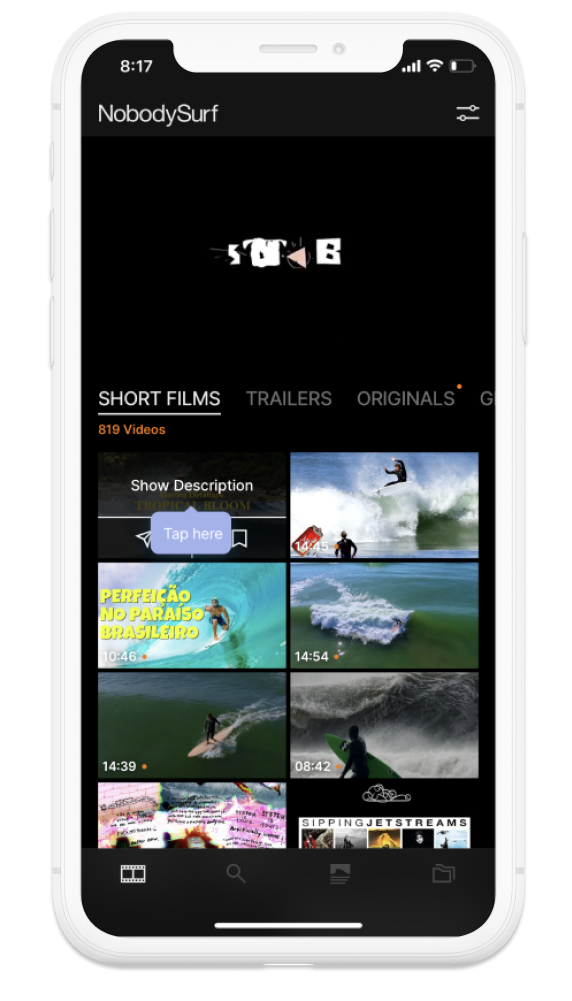
Coaching
The app provides a few coach marks scattered around here and there.
Some of which are less helpful than others.
This example of “Tap here” is helpful but I believe it may be kind of irrelevant.
This coach mark could be improved by providing a little more information.
For example “Tap here to watch” or
”Tap here for video description” etc.
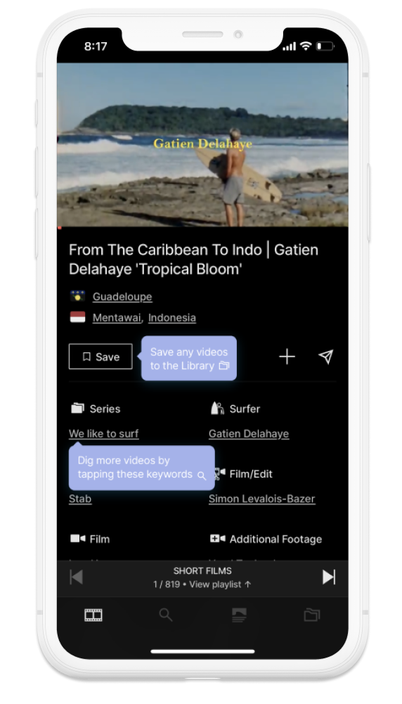
Coaching Continued
I found a few examples of coach marks that were a little more descriptive when exploring the app.
The save coach mark was nice as it included the icon of where I presume the video would be saved on the tab bar.
Perhaps the save icon in the button could also be changed to be the same as the one in the tab bar to make it more obvious.
I did not understand, “Dig more videos by..” I found the language here a little unnatural.
Contextual Permision Requests
I wanted to add this notification view as an example.
This view clearly shows the benefit of enabling push notifications. Much more so than simply requesting it as a system prompt earlier in the onboarding flow.
The call to action is also very clear.
In this case however I had already burned the system prompt earlier in the onboarding flow by denying push notifications.
After reading this I clearly understood the value of receiving push notifications and hit the button. Oh no, because I had already burned the system prompt I was taken to settings and I needed to dig through App preferences and settings to enable notifications.
I believe it would be better to follow the example on the left. Delay requesting notifications at a system level until the user has understood the value. Once they are convinced and hit the button, then display the system prompt for a better experience. This adds the benefit of not burying a system prompt until the user is ready to opt-in.
Final Thoughts
All in all not a bad onboarding experience despite being clunky in a few areas. The small improvements I have suggested here would make for a more seamless experience not doubt end in a higher conversion on key business metrics.
Key takeaways:
- Try not to be in a rush to grab permissions. The more effort you invest into providing context when obtaining permissions the higher the conversion rates you will receive.
- It is really important to understand the feeling users will have when going through your onboarding experience. Remember to test and ask key questions about how the onboarding experience made you feel.